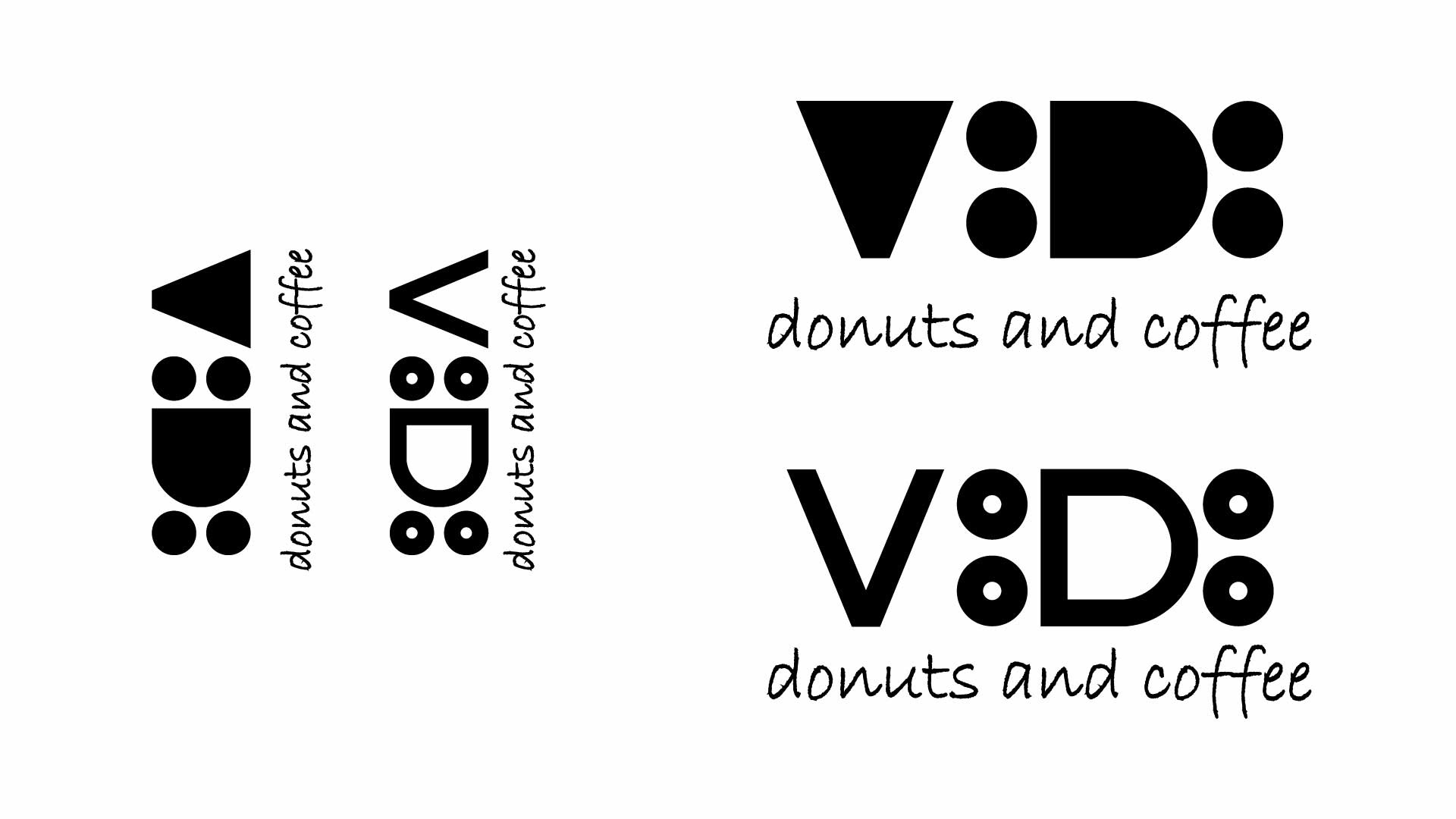
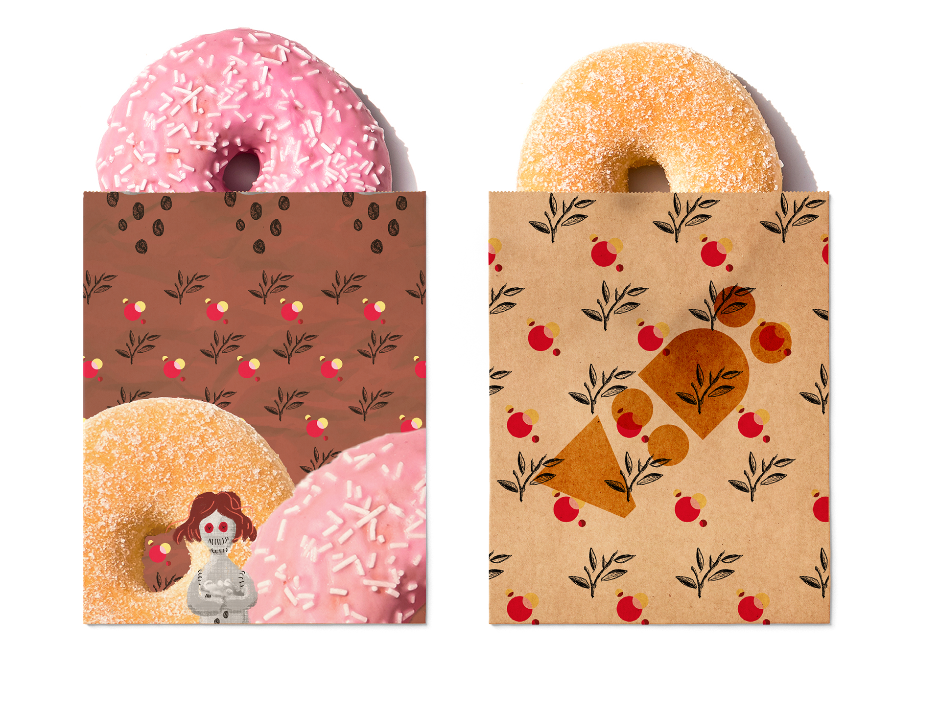
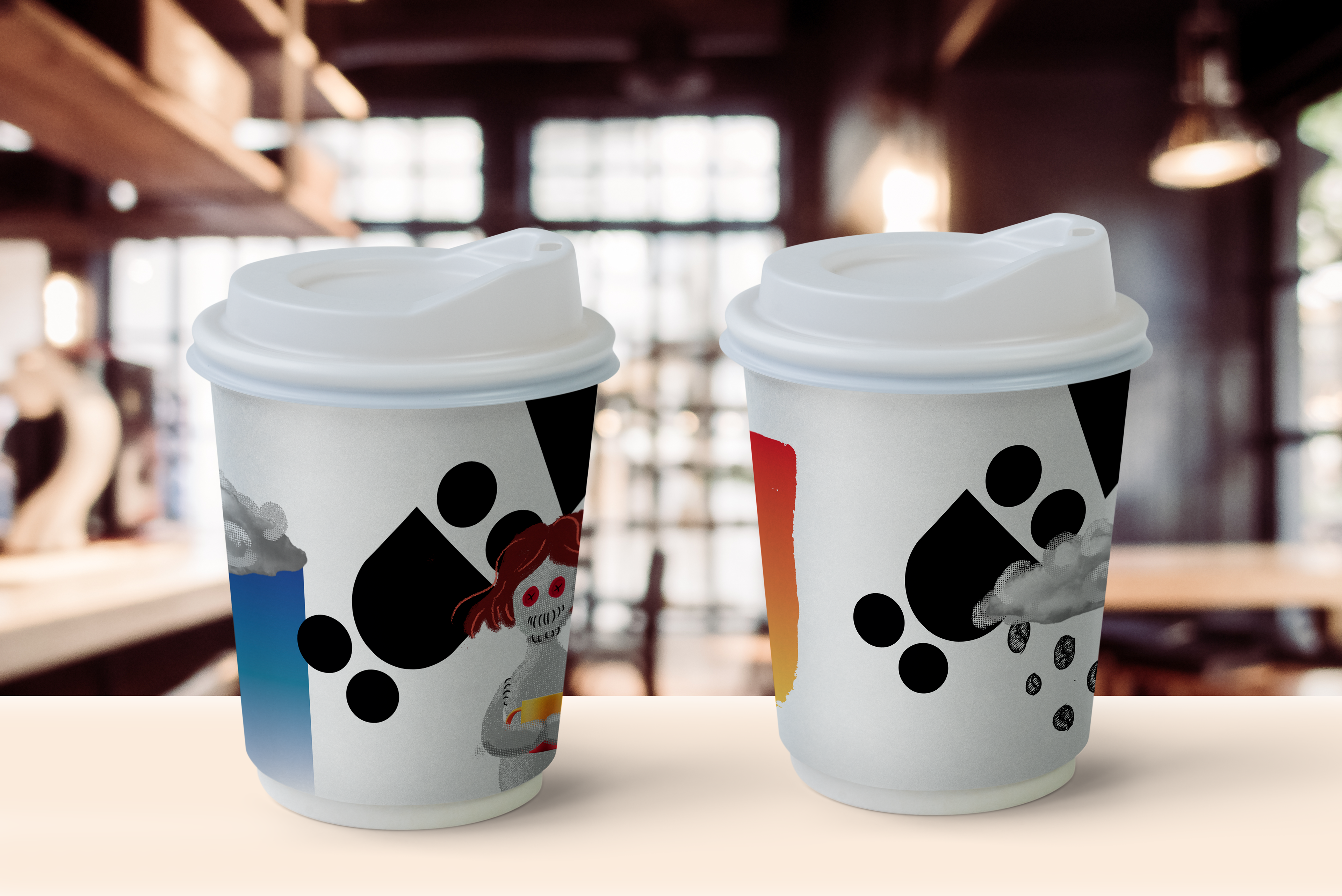
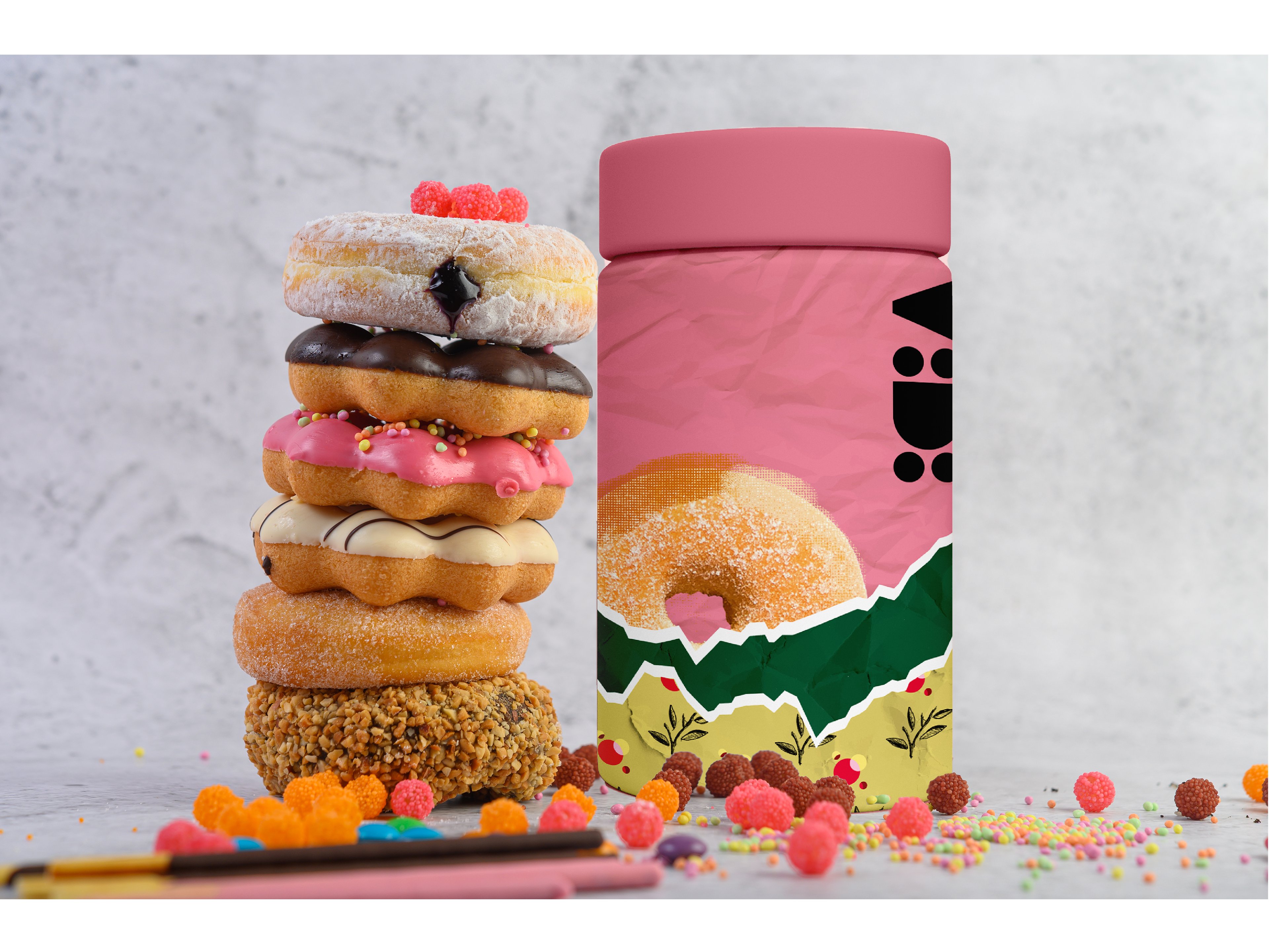
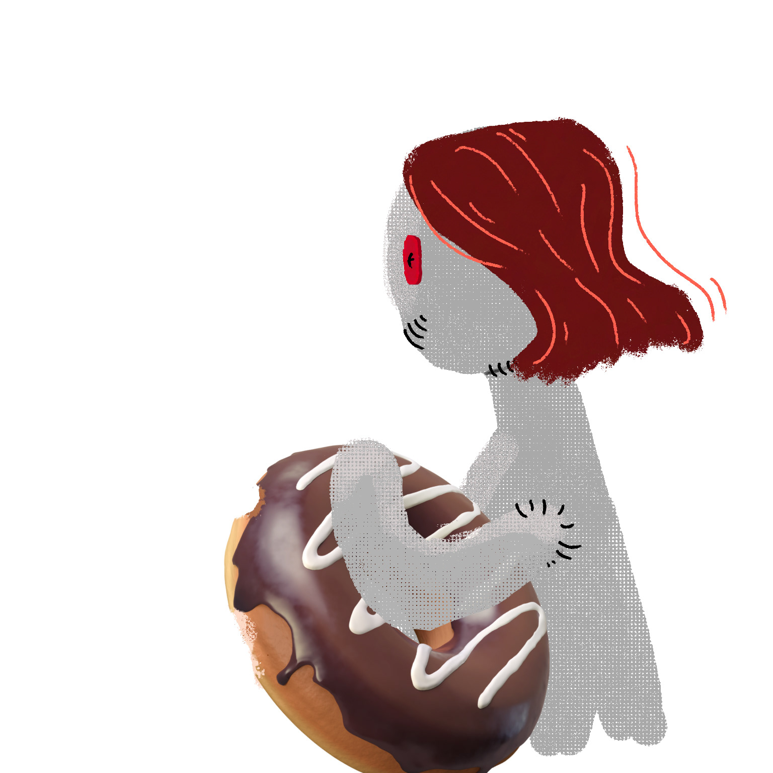
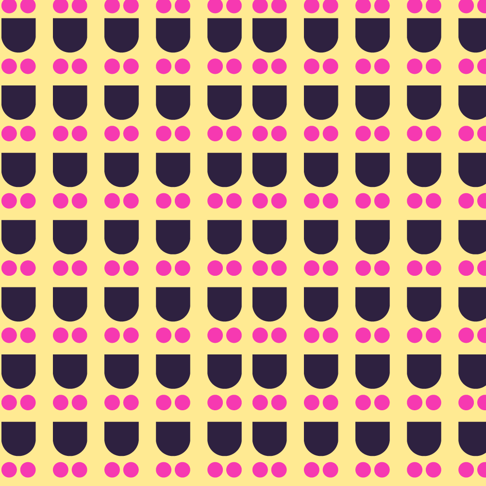
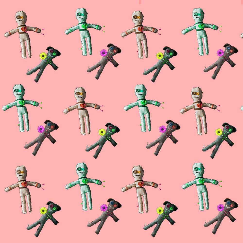
As part of my studies, I was given an assignment to choose a word and create branding for it as a coffee and donut shop. I chose the word "VOODOO," and the branding was based on illustrations that evoke a cozy and warm feeling. The colors, textures, and illustrations were carefully selected to create an interesting contrast between the welcoming atmosphere of the branding and the mysterious, darker stigma associated with the term voodoo. The branding successfully generates interest and surprise, while conveying an unexpectedly pleasant vibe.
במסגרת הלימודים, קיבלתי משימה לבחור מילה ולבצע לה מיתוג כבית קפה ודונאט. בחרתי במילה "VOODOO", והמיתוג התבסס על איורים המשרים תחושה ביתית וחמימה. הצבעים, הטקסטורות והאיורים נבחרו בקפידה כדי ליצור ניגוד מעניין בין התחושה שהמיתוג מעניק לבין הסטיגמה המסתורית והאפלה שמתקשרת למונח וודו. המיתוג מצליח לעורר עניין ולהפתיע, כשהוא משדר אווירה נעימה ולא צפויה.